Finding one song out of 5,000 shouldn’t feel like gambling.
This project began with a simple brief:
“Pick any device with a display that has a UX flow.”
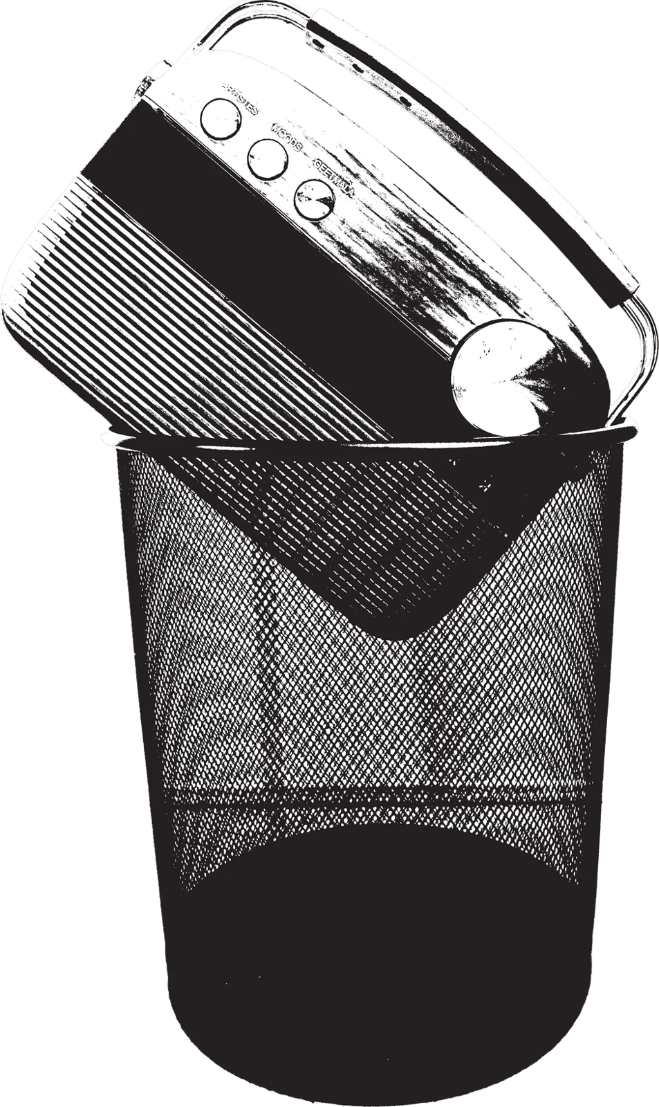
I picked the Saregama Carvaan — a retro radio preloaded with 5,000 old Bollywood songs — and found that the thing people loved about it was also what made it hard to use. The work became about bridging emotion and control.
Assisted and mentored by Prof. Shikher Saxena and Prof. Sumit Dey, Faculty, Interaction Design, UID Gandhinagar.
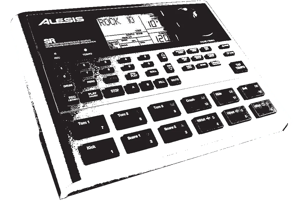


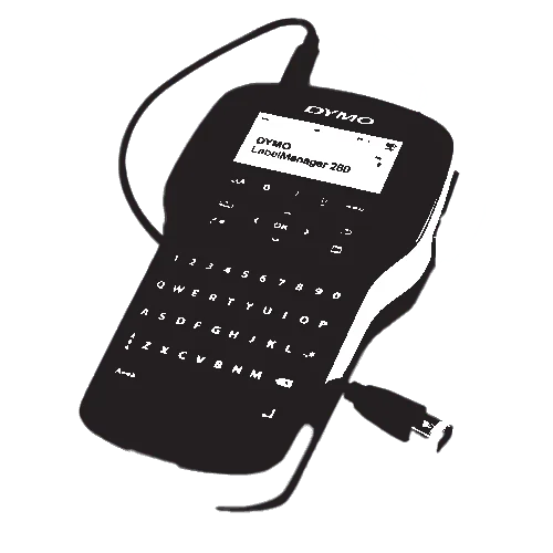
Finding that wasn’t easy
I tried the UPI box. Then a label maker. Even a drum machine.
Why Carvaan? Because it felt like me.
I didn’t pick Carvaan for convenience; I liked it because it represented who I am: someone who loves simplicity, old memories, and meaningful design.
But once I looked deeper, I realised something important:
Loving a product gives you blind spots. You stop seeing its flaws.
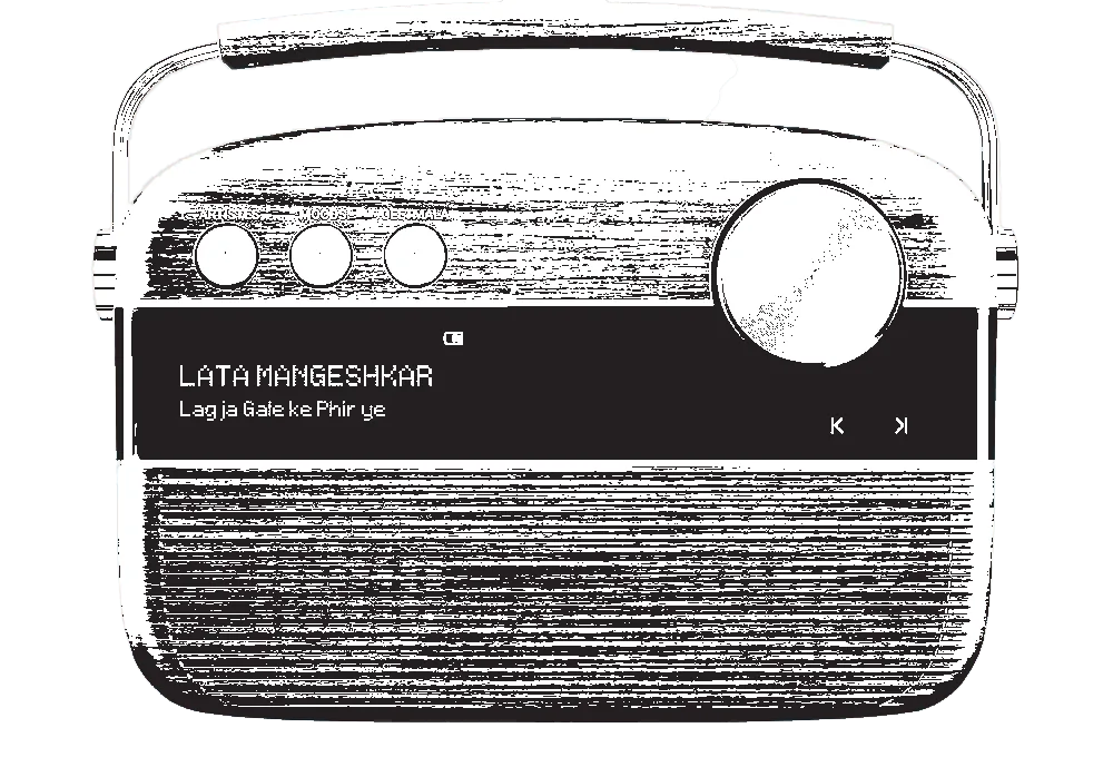
Beautiful looks. Complicated operation.
Key pain points:
- No preview of the next song
- Inconsistent display vs playback
- 100+ clicks to reach one song
- No sense of “where am I in this list?”





Everyone loved the nostalgia but struggled with control
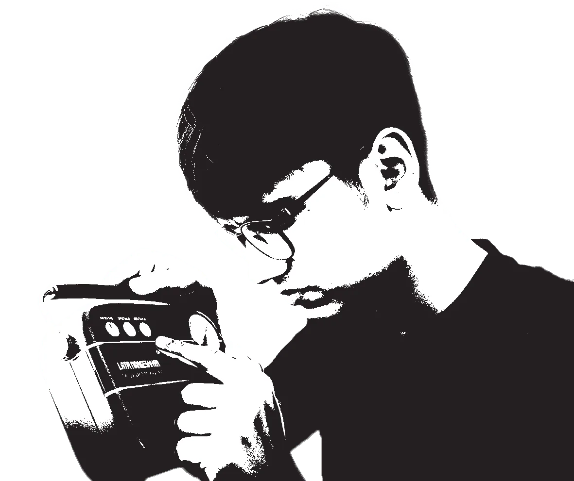
Hover or tap each person to hear what they said
The issue wasn’t usability alone — it was the disconnect between emotion and control.
Empathy map
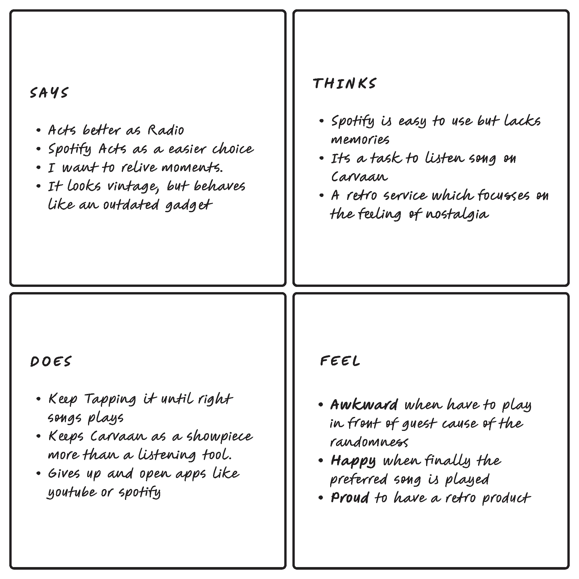
OutcomeUsers don’t just want music — they want to relive memories effortlessly.
“Stop designing a product. Start designing an experience.”
My faculty asked the question that changed everything: “Is this even you?”
- They reminded me to focus on the experience — not the buttons, not the screen.
- They redirected me from “fixing UI” to “understanding emotions, memories, and context.”
This moment shifted the entire project.

Data → Findings → Insight
Most adult users enjoy old Bollywood music for relaxation and nostalgia, but struggle to find specific songs. They keep clicking through 5,000 tracks with no preview or search — often giving up and switching to Spotify or YouTube.
The tough navigation irritates users quickly. Scrolling 5,000 songs makes them give up and switch platforms to listen to their favourite music.
Elderly listeners need a way to cherish vintage music where they can easily reach any song they want — to relive those golden memories without any obstacle.
Where the real pain was
To see where the experience was failing, I broke the journey into a task analysis. A simple goal of playing “Lag Jaa Gale” turned into endless skipping with no sense of progress.
It became clear that finding one song wasn’t slow… it was uncertain.
GoalPlay a specific song quickly and easily on the Saregama Carvaan.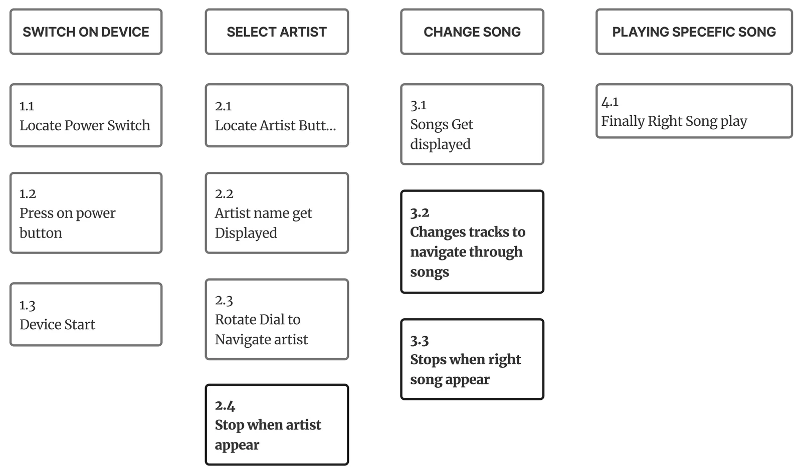
The task analysis revealed the real pain: blind navigation, endless skipping, no sense of progress. The next step was to reframe that frustration into design opportunities.
- How might we give users a clear sense of “where they are” while browsing?
- How might we find 1 song in a list of 5,000?
- How might we give elderly users more control without adding complexity?
“Old systems were more intuitive than we think.”
People identified songs through movies, not titles. They checked cassette covers, flipped them, read track numbers, and estimated time while fast-forwarding.
Older AM transistors made navigation intuitive with two dials: one for tuning between 1–10 and another for refining 10–100. Both systems were predictable, physical, and rooted in muscle memory — familiar rituals that made searching feel effortless.
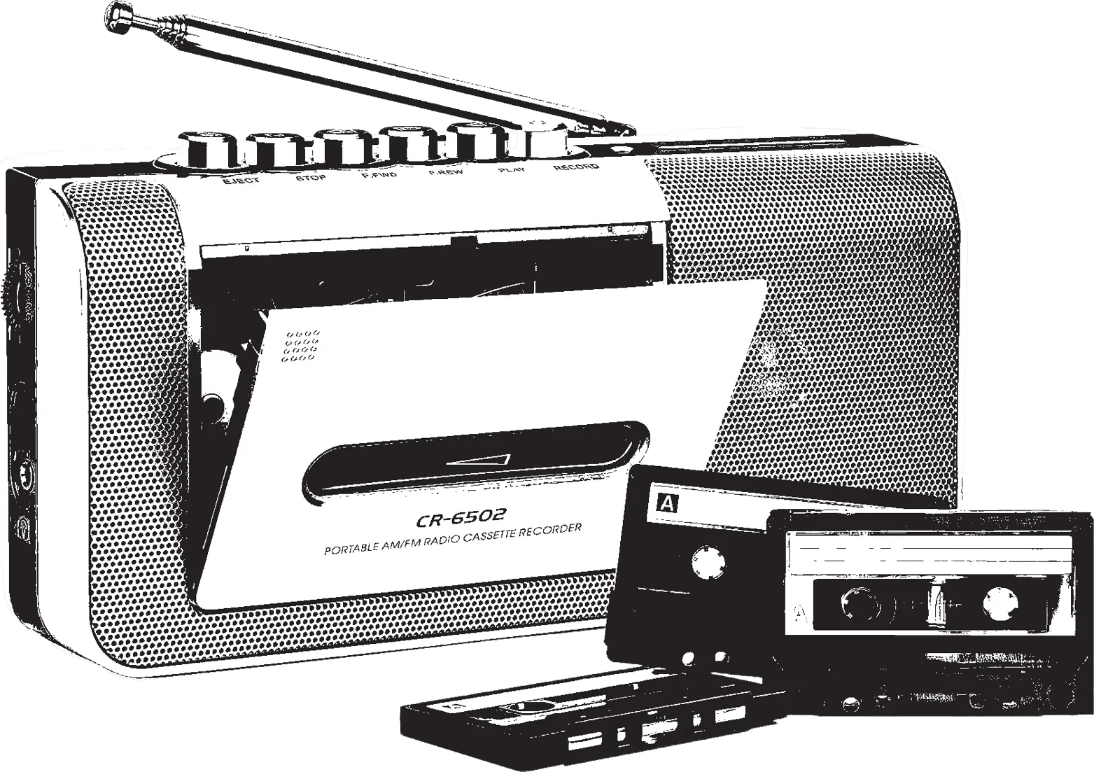

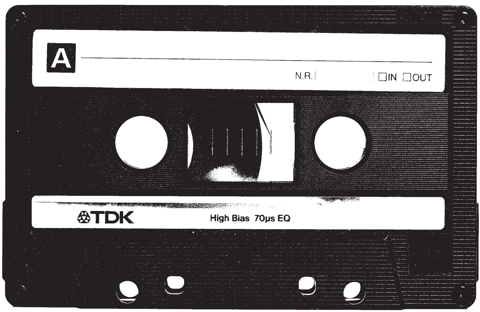
The redesign borrows the rituals people already know, instead of teaching new ones.
Two dials. Two screens. One clear journey.
Inspired by AM radios and cassette workflows, I reframed navigation into two parallel tracks. This recreated how people actually remember music — through films, actors, and moments.
Folders — Movies / Artists / Moods
Songs inside that folder
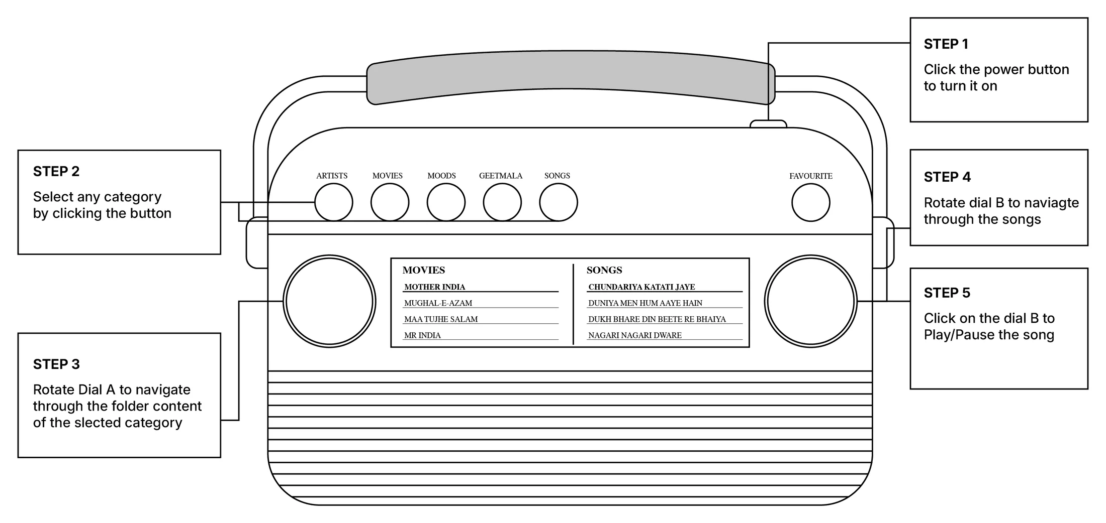
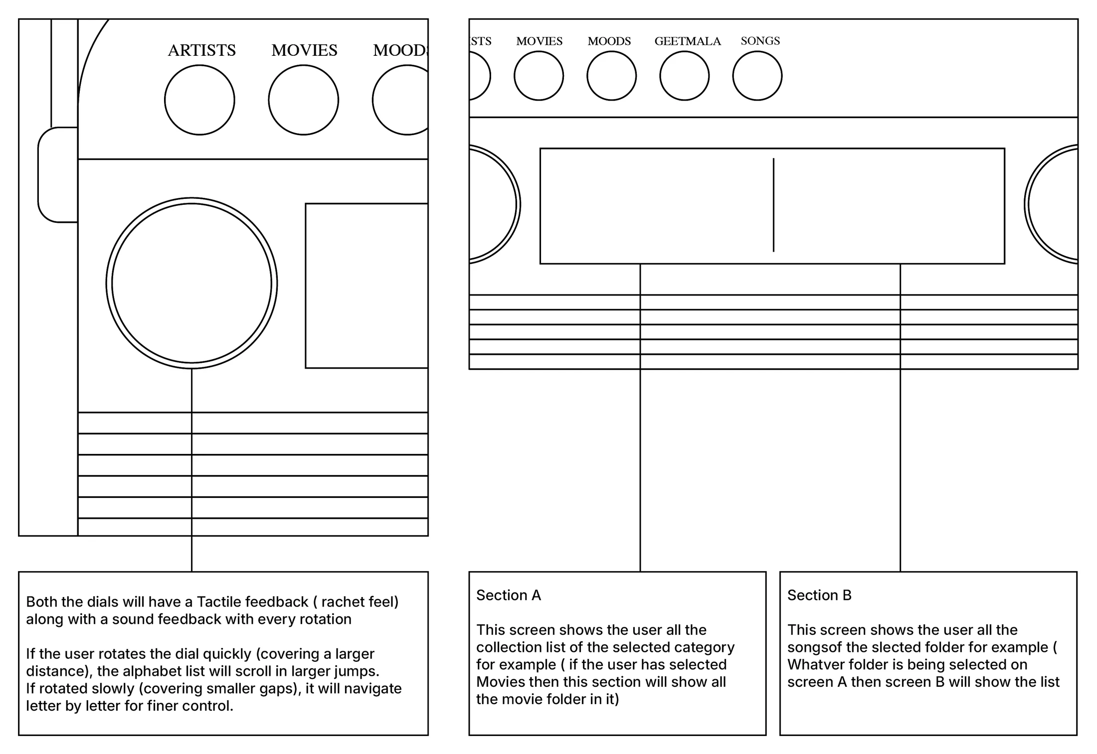
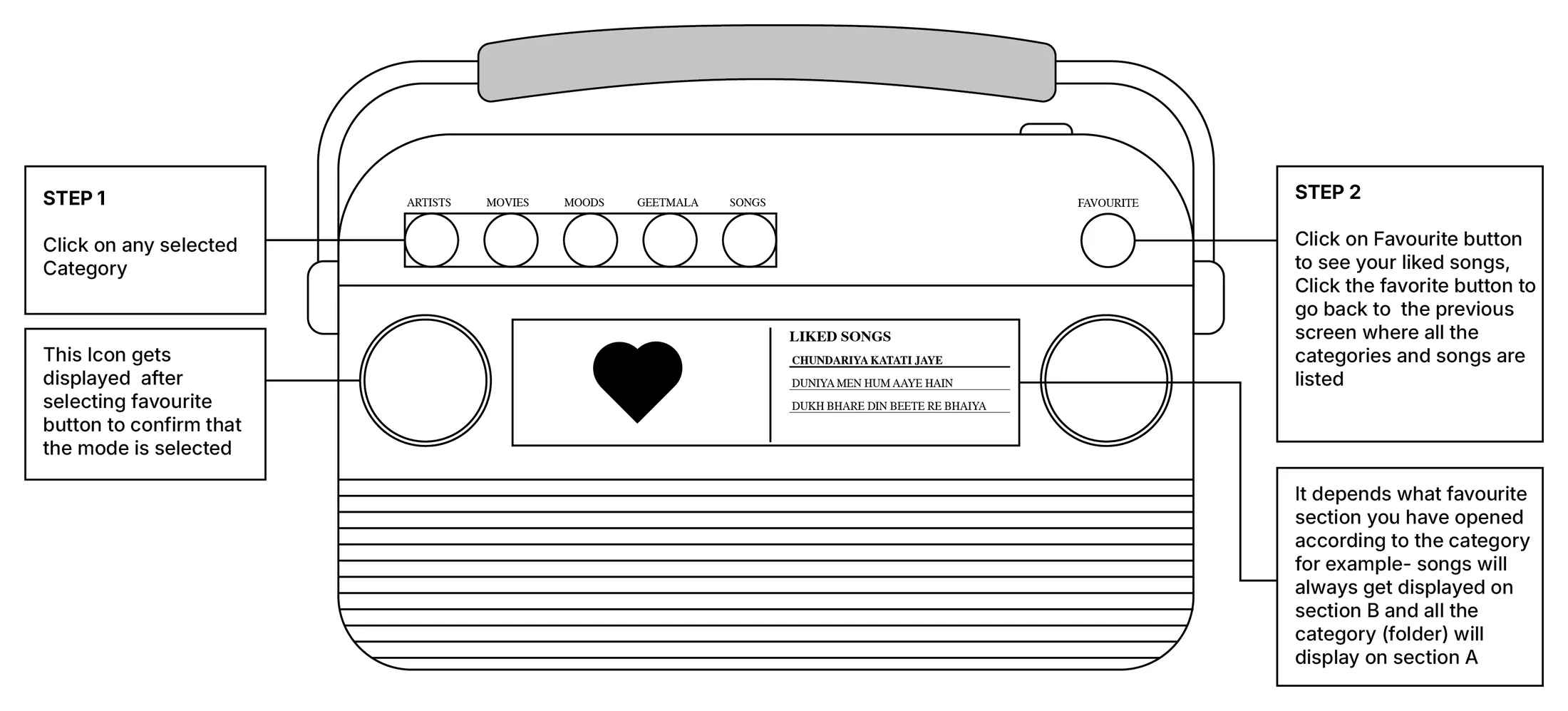
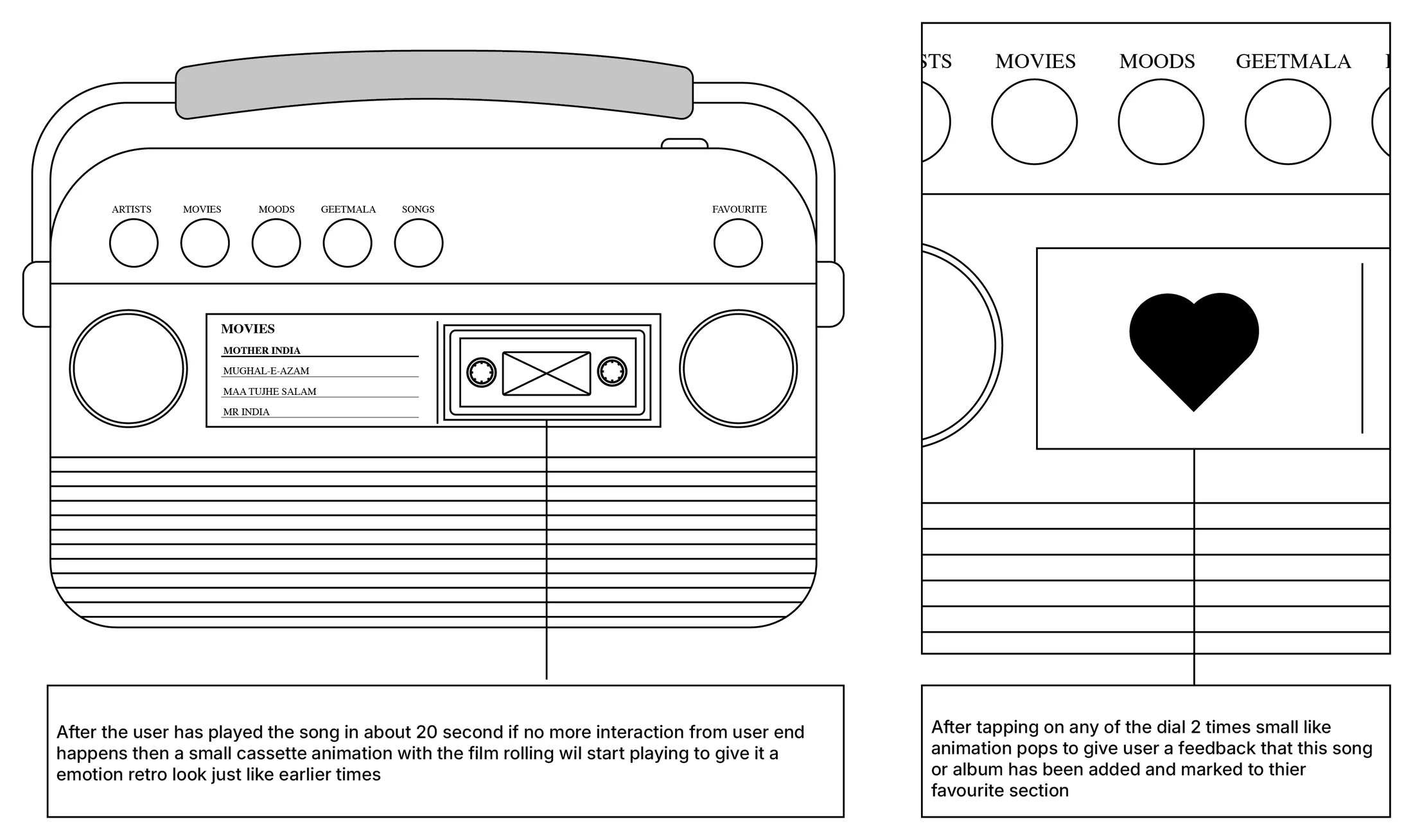
Why this works
- No more blind clicking
- Users can see the folder & the song at the same time
- Predictable movement — just like cassettes and radios
- Emotional continuity preserved

What this project taught me
UX is not just problem-solving — it’s perspective-shifting.
- Every design decision must connect to people’s emotions.
- Insights come from going deeper, not wider.
- Nostalgia is powerful when paired with clarity.
- Design is not linear — doubt and frustration are part of synthesis.